
A visual brand identity that stands out starts with a clear idea of who you serve and what you promise. You then express it through a small, fixed set of colours, typefaces, photo styles and words, and use that same set everywhere a customer meets you: signboard, website, WhatsApp, invoices and packaging.
Most Ghanaian SMEs do not have a branding problem so much as a consistency problem. The logo on the shop sign is green, the Instagram posts are purple, the invoice uses a different font, and the delivery rider’s T-shirt shows an old version of the name. Each one looks fine alone. Together they tell customers you are disorganised, or worse, that they may be dealing with a copycat. This guide shows how to define a simple visual identity and keep it consistent across the places that matter. If you are still at the stage of thinking a new logo will fix things, read why a logo is not a brand system first.
Start with the brand, then the visuals
Before choosing a single colour, write down three things on one page:
- Who you serve. Be specific: “working parents in Spintex who want school uniforms delivered”, not “everyone”.
- What you promise. The one thing customers should trust you for, such as speed, price, quality or care.
- How you sound. Three words that describe your personality, for example “warm, direct, local” or “precise, calm, expert”.
Every visual decision afterwards should support that page. A budget delivery service and a luxury interior designer should not look alike, even if both like blue.
The five building blocks
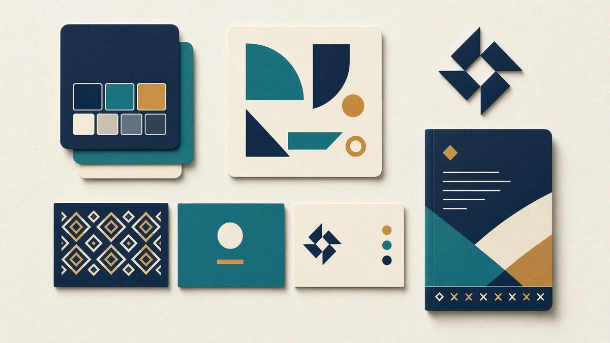
1. Logo, in versions that work everywhere
You need more than one file. At minimum: a full logo, a simple mark for small spaces such as WhatsApp profile pictures and app icons, and one-colour versions in black and white. Test the small version on a phone: if you cannot read it at the size of a WhatsApp avatar, simplify it.
2. A short colour palette
Pick one or two main colours and one or two supporting colours, with exact codes (HEX for screens, CMYK for print). Make sure text on your colours passes contrast checks, so people can read it on a cheap phone in bright sunlight. The WCAG 2.2 standard asks for a contrast ratio of at least 4.5:1 for normal text (W3C).
3. One or two typefaces
One for headings, one for body text, or a single family for both. Choose fonts that are free to use on the web and in print, so your designer, your website and your printer all use the same ones.
4. A photo and illustration style
Decide what your images look like: real photos of your team and premises, or illustrations; bright and busy, or calm and minimal. Real photos of your own work in Ghana usually beat stock photos of people who are clearly not your customers.
5. Voice and key phrases
How you write is part of how you look. Keep a short list: how you greet customers, how you sign off, your tagline, and words you never use.
Where consistency breaks, and how to fix it
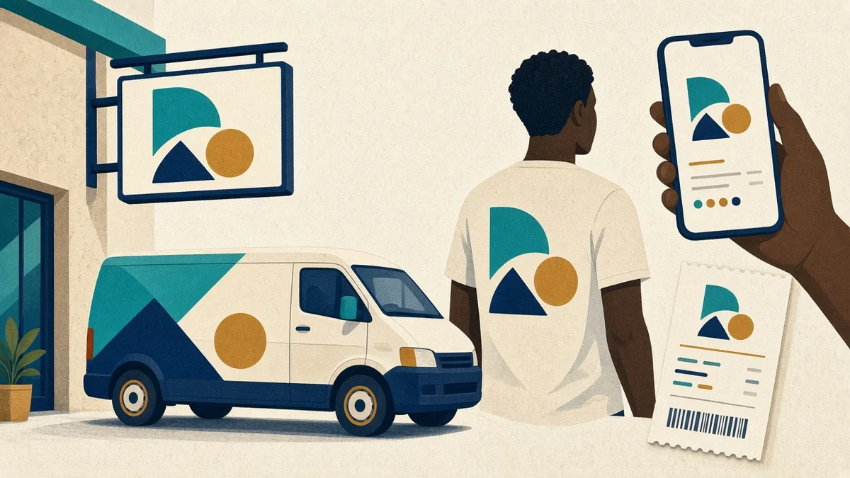 These are the eight places we most often see brands drift:
- Signage and premises. Repaint old signs when you change your identity. A faded sign undoes a new website.
- Website. Use your exact colours and fonts, not “close enough” theme defaults. Our guide to website design in Ghana that converts covers the layout side.
- Social media. Use templates for posts and stories so that anyone on the team produces on-brand graphics.
- WhatsApp Business. Profile photo, business description, catalogue images and quick replies should all match.
- Invoices, receipts and payment pages. Customers paying by MTN MoMo or Telecel Cash see your name and logo at the moment of trust. Make sure the merchant name on the payment prompt matches your brand, so no one thinks it is a scam.
- Packaging and delivery. Stickers, bags and rider uniforms travel all over the city for you.
- Staff and email signatures. One signature template for everyone.
- Print and events. Flyers, banners and roll-ups, printed from approved files only.
Write it down: the one-page brand guide
You do not need a 60-page brand book. A one- or two-page guide that anyone on your team can follow is enough:
- Logo versions, with “do” and “don’t” examples
- Colour codes
- Fonts, with sizes for headings and body text
- Three example photos showing your style
- Voice: three words, a tagline and the phrases to avoid
- Where the files live, such as one shared Google Drive folder with the latest versions only
Give it to every printer, freelancer and new staff member.
Common mistakes to avoid
- Copying a big brand’s look. Customers notice, and it makes you look like an imitation, not a rival.
- Choosing colours you cannot print or paint. Check how your palette looks on a signboard, a T-shirt and a phone screen before you commit.
- Letting everyone make their own graphics. Give the team templates, and keep one person responsible for approving anything new.
- Changing everything every year. Recognition takes time. Small, planned updates build trust; constant changes erase it.
- Forgetting the boring documents. Quotes, delivery notes and payment receipts are seen by paying customers more often than your adverts.
Refresh or rebrand?
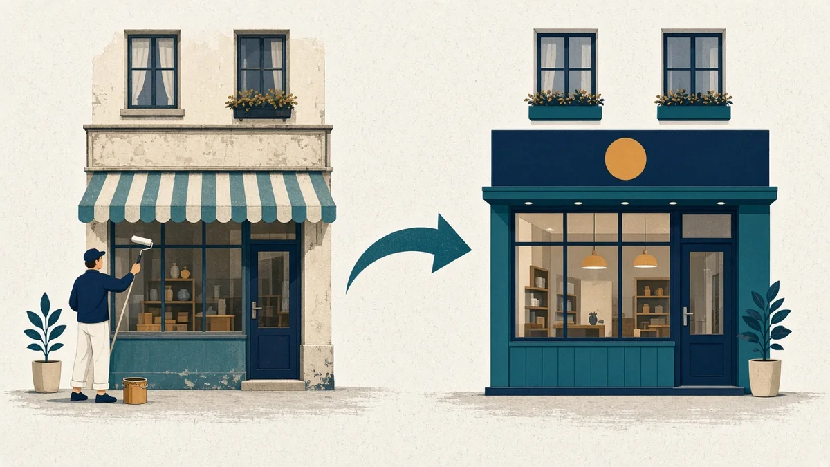
- Refresh if people recognise you and like you but the visuals look dated or inconsistent. Keep the name and core colours, and tidy everything else.
- Rebrand if you have changed what you sell or who you sell to, if your name causes confusion, or if your current identity actively hurts trust.
A refresh is cheaper and keeps the recognition you have earned. Most SMEs need a refresh, not a rebrand.
How PED Solution Studios can help
We design brand identities and the systems that keep them consistent: logo suites, palettes, templates and a short brand guide. Then we apply them to your website, social media and documents. See our branding services. If you need a website to go with it, our GH₵4,499 website package includes WhatsApp chat integration, SEO, social media links, and a free domain and hosting for the first year.
Frequently asked questions
What is the difference between a brand and a visual identity?
Your brand is what people think and feel about your business. Your visual identity is the set of colours, fonts, images and logo that signal it. Visual identity supports the brand; it cannot replace it.
How many colours should a brand use?
Usually two main colours and one or two supporting colours. Fewer colours are easier to keep consistent.
Do I need a brand guide for a small business?
Yes, but a short one. One or two pages that your team, printer and designers can follow will prevent most inconsistency.
How long does a brand identity project take?
It depends on scope. A logo refresh with a palette and a guide is much quicker than a full rebrand with a new name, signage and packaging. Ask for a timeline with clear review stages.
Should my WhatsApp profile match my logo?
Yes. Use the simple version of your logo so it stays readable at small sizes, and match your business name exactly.
Ready to make your brand look like one business?
Book a call or send us a message. We will review your current touchpoints and tell you what to fix first.