A logo is not a brand system. Product UI will expose the gap.
If the marketing site and the product feel like two companies, you do not have a brand. You have a mark.
Branding
If the marketing site looks expensive and the product looks like a different company, you do not have a brand. You have a mark, a campaign, and a leftover UI kit.
We see the split constantly. A studio ships a confident identity: type, color, a mark that photographs well. Six months later the app launches with a default component library, a different gray, buttons that could belong to any SaaS, and empty states written like error logs. Customers feel it even if they cannot name it. They trust the ad, then they use the product, then they quietly downgrade their expectation of the whole company.
Brand is the promise. Product UI is the promise kept or broken at thirty frames a second.
A logo is a handle, not a system
A logo is useful. It is how people point. It is not how people experience you for more than a second.
A brand system is the set of decisions that stay true when the work leaves the brand guidelines PDF.
How a headline sounds when it is a success toast, not a campaign.
How much space a screen is allowed to waste.
What "primary" means when it is a button, a chart, and a warehouse sticker.
What you do when there is no photo, no data, and no time.
If those decisions were never made, the product team will invent them under deadline. That invention becomes the real brand, because that is what customers touch every week.
Brand work that stops at identity is unfinished. Identity is the first chapter.
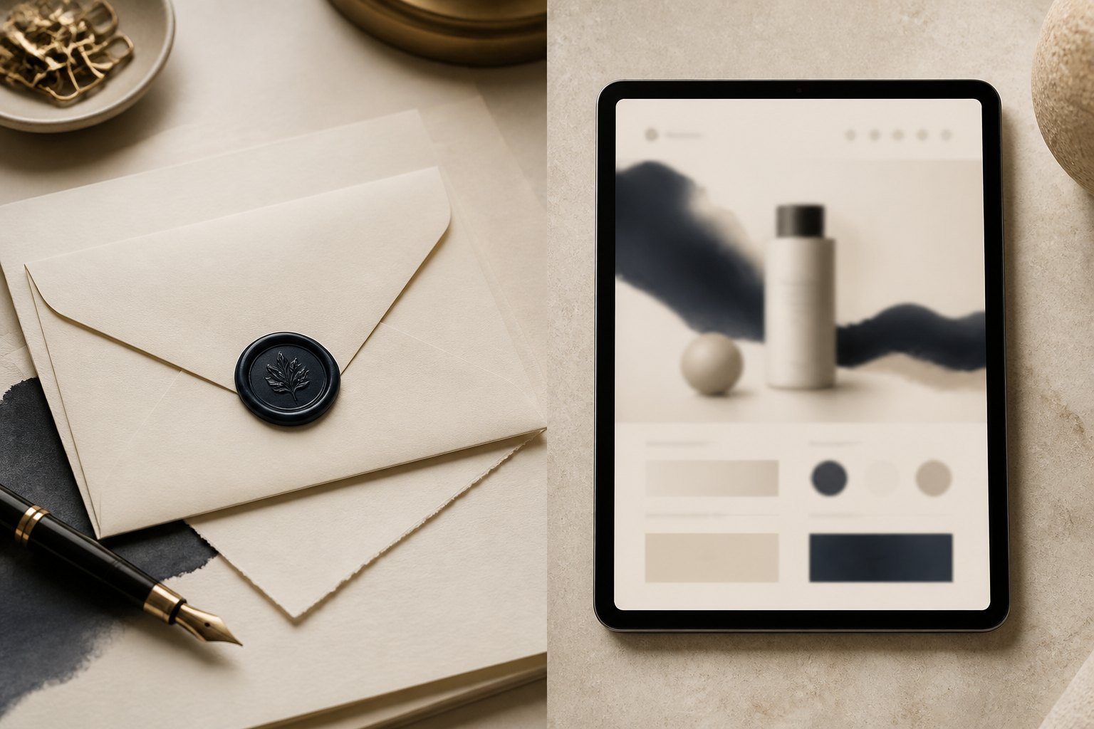
The product will expose every vague decision
Marketing can hide vagueness with photography and a short page. A product cannot. It has to solve Tuesday.
Tuesday is: a form with eight fields, a failed upload, a user who is not your persona, a language you did not design for, and a support agent trying to find the same information in two tools.
If the system only specified a logo clear space and a "do not stretch" rule, Tuesday will be designed by whichever engineer had the ticket. That is not a moral failure. That is an empty system doing what empty systems do.
The gap shows up in predictable places.
Voice that cannot survive a form
Campaign voice is often confident and short. Product voice has to be specific and calm. If you never wrote the product voice, you get a mix of legal caution, developer English, and leftover marketing adjectives.
Write the boring sentences first. "We could not save this listing." "This file is waiting on two documents." "You are about to release payment." Those sentences are the brand more than the tagline.
Color that was chosen for a poster
A saturated brand color that sings on a billboard can bully a dense table. A pale luxury palette that feels expensive on a homepage can make an app feel unfinished.
A system needs roles, not just a palette. What is action. What is warning. What is quiet structure. What is never used for a button. If everything is the hero color, nothing is.
Type that was chosen for a wordmark
A display face can carry a cover. It cannot carry a settings page. The system has to say which face does work, at which sizes, and what happens when the language gets longer than English.
Components that were never blessed
If marketing and product do not share buttons, inputs, cards, and empty states, you will get two companies. Designers will "make it on brand" by pasting the logo in the header. Users are not fooled.
What a system that survives growth actually contains
You do not need a 200-page bible. You need a kit that a product team can use without calling the brand studio every Friday.
We keep the kit in five layers.
Meaning. Who it is for, what you refuse to sound like, what "quality" means in one paragraph.
Identity. Mark, lockups, clear space, the few rules that prevent accidents.
Voice. Campaign, product, and support as three registers of the same person.
Tokens. Color roles, type roles, space, radius, elevation. Names that mean jobs, not "blue 2."
Components. The actual buttons, forms, tables, empty states, and navigation the product is allowed to use.
The last two layers are where most brand projects stop too early. Tokens and components are how the identity becomes software.
When a product grows — a second app, a dealer portal, a customer dashboard — those layers are what keep the family resemblance. Without them, each new surface is a remix, and the remixes drift.
How to brief brand and product as one project
If you are starting a company, or finally replacing a logo that has been "temporary" for four years, do not sequence this as brand first, product later, and hope they meet.
Brief them together.
Show the product surfaces that will exist in year one, even as wireframes.
List the states that will happen: empty, error, success, waiting on someone else, offline.
Decide who is allowed to add a new color. (The correct answer is almost nobody.)
Give the product designer a seat in the identity review, and the brand designer a seat in the UI review.
The argument you want early is "this red is too loud in a table." The argument you do not want late is "why does the app feel like a different firm."
This is also why we treat brand strategy and product UI as related work, not neighboring departments. The customer does not have departments.
A practical audit you can run this week
Open your homepage and your most-used product screen. Put them on one desk.
Ask only these questions.
Could these two artifacts come from the same company if you covered the logos.
Do the buttons mean the same kind of action.
Do the words sound like the same person on a good day.
Is the density honest. A luxury homepage and a cramped admin can still be family if the type, color roles, and voice agree. They cannot if only the logo agrees.
What would a new screen inherit. A file, a library, a memory.
If the answer to inheritance is "memory," you do not have a system. You have taste, and taste leaves when people leave.
What we will not do
We will not sell a logo as a transformation.
We will not write guidelines that only show the mark on a yacht, a truck, and a business card if the real product is a table of records.
We will not "make the app pop" by dropping campaign gradients on a working tool. Working tools need dignity, not a launch video.
And we will not pretend a component library downloaded from the internet is your brand because someone changed the primary hex.
If you are about to launch a product, or you already feel the split, bring both surfaces. Start a project with the homepage and the screen people use after they pay. That pair is the brief.
A mark gets you recognized. A system gets you believed after the click.
By PED Solution