
Your website is a product. Treat it like one.
A brochure with a contact form is not a product. Goals, paths, speed, and measurement are.
Design and Development
A company website is not a brochure that happens to live on a URL. It is a product with a job. If you cannot name the job, you will decorate the wrong thing.
In 2022 the internet was still full of advice about "having a professional presence." That bar is now the floor. Your competitors have a professional presence. Your buyers have already compared three of you on their phone in a parking lot. The site that wins is the one that helps them do the next useful thing without a scavenger hunt.
We used to write about website strategy as if goals were a workshop exercise. They are. They are also a product spec. Treat the site the way you would treat an app: one primary job, a path, a measurement, and a weekly habit of fixing what the path refuses to do.
Give the site one job
Most sites fail because they are asked to be the brand museum, the sales team, the careers page, the blog, and the founder's personality all at once, with equal volume.
Pick the job for this quarter.
Get the right lead to book a conversation.
Get a qualified buyer to request a quote.
Get a user to start a product trial.
Get a partner to understand who you serve and contact you.
Secondary jobs can live in the footer. They should not fight the first screen.
If your homepage headline could sit on any agency or any contractor in your city, the site does not have a job. It has a vibe.
For us, the useful test is simple. A stranger who lands from a search or a referral should know, in ten seconds, who the work is for and what to do next. If they have to "explore," you already lost the people with the least time and the most budget.
Design the path, not the pages
Pages are rooms. Paths are why rooms exist.
A conversion path is a sequence with as few optional doors as possible. For a services firm that might be: understand the offer, see proof, pick a time, confirm. For an ecommerce catalog it might be: find the thing, trust the thing, pay, know what happens next.
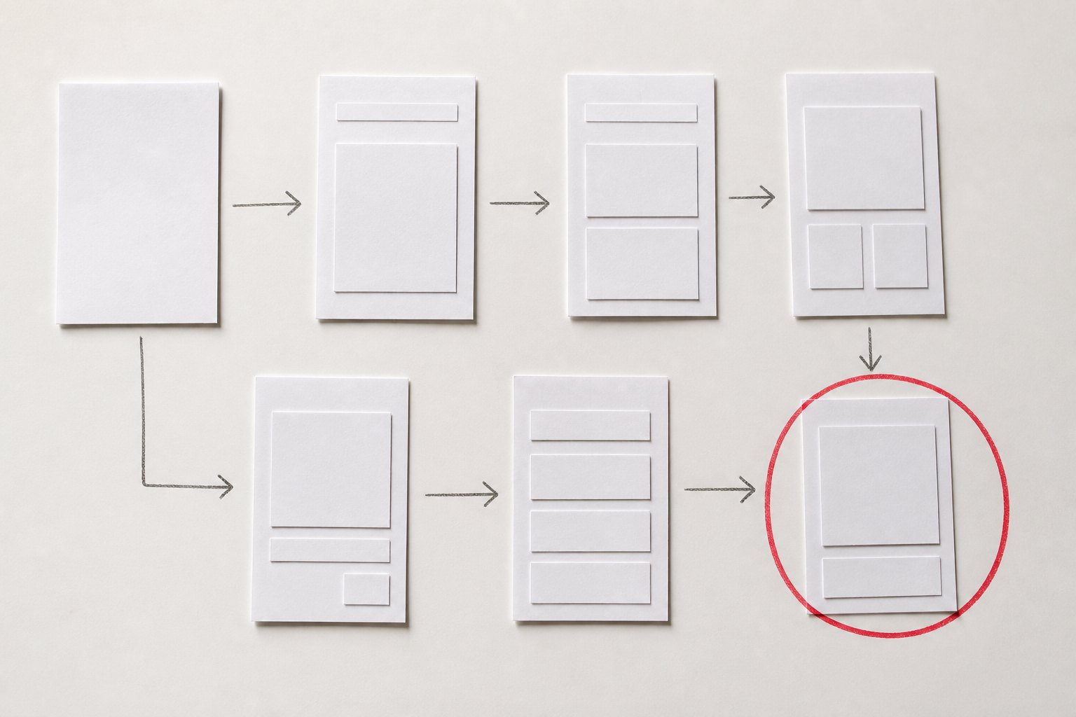
Write the path as five boxes on paper before you open Figma.
Entry. Where they came from and what they already believe.
Promise. One sentence they can repeat to a colleague.
Proof. Work, process, or specificity that a template cannot fake.
Action. Book, buy, call, or start. One primary action.
After. What happens in the next hour so they do not feel they shouted into a form.
If you offer conversations, the action is not "contact us" as a mystery. It is a real booking flow, like book a session, with times that exist and a confirmation that does not feel like a black hole.
Mystery forms train people to leave and email a friend instead.
Trust is a product surface
Trust is not a testimonials slider you add at the end. It is the whole texture of the site.
Buyers look for signs you have done this before and will still be here after the invoice. They look at the work, the specificity of the process, the speed of the page, the clarity of who you are, and whether the next step feels safe.
Useful trust, in order of what actually moves a careful buyer:
Specific work, named constraints, and honest scope. "We built a marketplace for heavy equipment" beats "we deliver excellence."
A process they can picture. Discovery, brief, build, handoff. No fog.
Contact that is a person-shaped path, not a void.
Technical hygiene. The page loads. The form works on a phone. The privacy story is not an afterthought.
Stock photos of handshakes do the opposite of trust. They say you did not have anything true to show.
If you have project pages, use them as proof, not as decoration. Link the path to website and development only when that is the job. Do not turn every page into a services directory.
Speed is part of the offer
A slow site is a product defect. People experience it as doubt.
You do not need a manifesto about Core Web Vitals. You need the hero to appear quickly, the images to be honest about their weight, and the booking or checkout script to fail loudly if it fails. Silent failure is how you lose the best leads: the ones who were ready.
We still see sites that look expensive in a screenshot and feel cheap in a thumb. That gap is a product bug, not a "hosting issue" you mention later.
Measure the job weekly
If you are not looking at the path every week, you are decorating.
You do not need twenty dashboards. You need a short list.
How many people reached the action page.
How many completed the action.
Where they left.
Which referrers sent people who complete.
Then you change one thing. The headline. The proof above the fold. The number of fields. The time-to-first-useful-content.
A website treated as a brochure gets a redesign every three years and a shrug in between. A website treated as a product gets small repairs the way an app gets small repairs. That is how a site stays aligned with the business you are actually running.
The first-screen test
Open the homepage on a phone. Cover the logo. Can a stranger still tell what you sell and what to do next. If the answer depends on the logo, the first screen is decoration.
Then scroll until the action. Count the taps. If you need more than two, you are asking tired people to work for you. Serious buyers are tired. They will not hunt.
Do this test after every content change. It is faster than a workshop and ruder than a heatmap. Rude is useful.
What to stop doing
Stop launching pages because a stakeholder wanted their department represented on the homepage.
Stop writing headlines that could belong to a holding company in any country.
Stop hiding the action behind "learn more" five times.
Stop treating SEO as a pile of blog posts disconnected from the job. If the article cannot send a qualified person into the path, it is a hobby. (This series exists to send you into a clearer brief, not to collect traffic for its own sake.)
Stop copying a template and then wondering why you sound like the template.
A working brief for a site rebuild
If you are about to rebuild, write this before you hire anyone, including us.
The one job for the next two quarters.
The one action that counts as success.
The three proofs you are willing to put on the first screen.
The audience you will disappoint on purpose.
The weekly owner of the measurement.
That last line is the difference between a launch and a product. Someone has to keep the path honest after the new colors ship.
When we do website and development, we would rather argue about that brief than about whether the hero should be a video. Video is easy. A job is hard.
If you already know the job and the path is a mess, start a project. Bring the one action you want more of. We will treat the site like a product, because that is what your buyers already do.
By PED Solution