
UX and UI design decide whether a visitor stays after the first screen. UI is what they see: layout, colour, type and buttons. UX is how easily they get what they came for. For a Ghana business site, a good first impression means fast loading on mobile data, a clear message, one obvious next step, and visible trust signals.
Most of your visitors will judge you on a phone. In October 2026, about 68% of web traffic in Ghana came from mobile devices (StatCounter, Ghana platform market share). So the “first impression” is usually a small screen, an Android browser and a data bundle that someone would rather not waste.
UX and UI: the difference in plain terms
UI (user interface) is the visual layer: the logo placement, colours, fonts, spacing, images and buttons. UX (user experience) is the whole journey: how quickly the page loads, whether the menu makes sense, how many taps it takes to get a price, and whether the contact form actually works.
A site can have beautiful UI and poor UX, like a smart shop with a locked door. It can also have good UX and weak UI, which works but feels less trustworthy. You need both, and on the first screen they work together.
What happens in the first few seconds

When someone lands on your site, they ask three quick questions, usually without noticing:
- Am I in the right place? Your headline should say what you do and for whom, in plain words. “Catering for offices and events in Accra” beats “Excellence redefined”.
- Can I trust this business? Real photos, a physical location, reviews, and familiar payment options such as MoMo or card help.
- What do I do next? One clear button: call, WhatsApp, get a quote or order now.
If the page fails any of these on the first screen, many visitors go back to Google and pick the next result.
Speed is part of the design
A slow page is a design problem, not just a technical one. Google’s Core Web Vitals give useful targets: the main content should load within 2.5 seconds, the page should respond to taps within 200 milliseconds, and the layout should not jump around as it loads (web.dev, Web Vitals).
Design choices drive these numbers. Large uncompressed hero images, auto-playing videos, heavy sliders and too many fonts all slow the first screen. Practical fixes:
- Compress images and serve modern formats like WebP.
- Replace sliders with one strong image and headline.
- Use one or two font families.
- Reserve space for images so text does not jump.
Make the first screen readable
Text must be easy to read in sunlight on a mid-range phone. The W3C accessibility guidelines recommend a contrast ratio of at least 4.5:1 for normal body text (W3C, WCAG 2.2). Light grey text on white may look elegant on a designer’s monitor, but it fails outdoors.
Other readability basics: body text around 16px or larger on mobile, short paragraphs, and buttons big enough to tap with a thumb without hitting the wrong one.
Navigation that matches how customers think
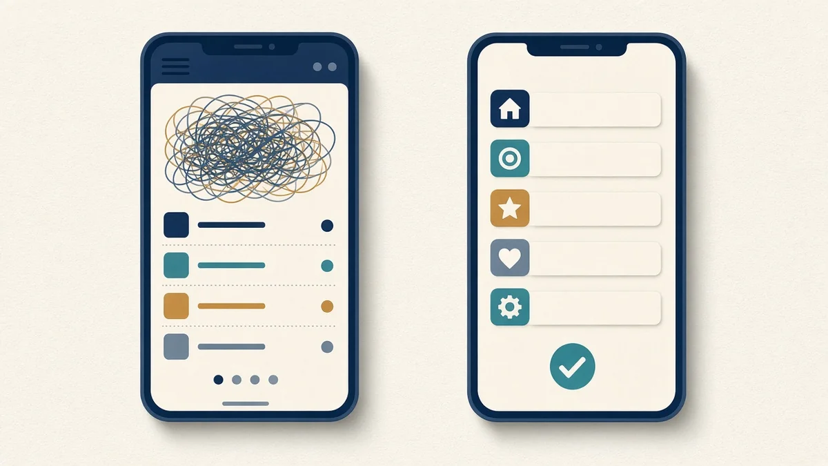
Organise your menu around what customers want, not your internal departments. Five to seven top items is usually enough: Services, Prices or Packages, Work, About and Contact. Put your phone number and a WhatsApp button where people can always reach them, especially on mobile.
Test it: give a friend your phone, open your site, and ask them to find a price and contact you. Watch where they hesitate. That is your UX to-do list.
Trust signals on the first screen
In Ghana, customers are cautious about paying businesses they do not know. Design can reduce that worry:
- Real photos of your team, premises or products instead of generic stock.
- Your location, with a map link, and opening hours.
- Payment options people recognise, such as MoMo and card, shown near the buy or order button.
- Short reviews or testimonials with permission from the customer.
- A working phone number and WhatsApp link.
Design for real conditions in Ghana
Designers often test on fast office Wi-Fi and new laptops. Your customers may be on a three-year-old Android phone, on a busy network, in bright sun, with a data bundle running low. Design for that:
- Test the site on a mid-range Android phone over mobile data, not just on desktop.
- Keep the homepage light. Every extra image or script costs the visitor data and time.
- Make phone numbers tap-to-call and addresses tap-to-open in maps.
- Write for people who are scanning, not reading: clear headings, short lines and bullet points.
- Avoid relying on hover effects, which do not exist on touch screens.
You can check your own pages for free with Google PageSpeed Insights, which reports Core Web Vitals for mobile and desktop and suggests what to fix first.
Common first-impression mistakes
- A pop-up that covers the page before the visitor has read anything.
- A homepage headline that says nothing about what you sell.
- Buttons that look like plain text, or text that looks like buttons.
- Prices hidden behind “contact us” when competitors show them.
- Contact forms with too many required fields.
From first impression to enquiry

A good first impression is only useful if it leads somewhere. Map the shortest path from landing to enquiry or payment and remove every unnecessary step. For most small businesses that path is: clear headline, proof, one button, a short form or a WhatsApp chat. For online shops, see our guide to an e-commerce website in Ghana that accepts mobile money.
If your current site fails several of these checks, read our article on website design in Ghana that converts, or check whether you need a redesign.
How PED Solution Studios can help
We design and build business websites with mobile-first UX, fast first screens and clear next steps. Our GH₵4,499 website package includes WhatsApp chat integration, SEO, social media links, and a free domain and hosting for the first year. You can see examples in our work.
Frequently asked questions
What is the difference between UX and UI design?
UI is the look of the interface: layout, colours, fonts and buttons. UX is the overall experience: how easy and fast it is for a visitor to do what they came for.
Why does website speed matter for first impressions?
Visitors judge a site before it finishes loading. Google suggests the main content should appear within 2.5 seconds, and slow pages lose visitors, especially on mobile data.
How can I test my website’s UX cheaply?
Ask three people who do not know your business to complete a task on your site, such as finding a price, while you watch silently. Note where they get stuck.
Do I need a full redesign to improve UX?
Not always. Compressing images, rewriting the headline, adding a clear button and simplifying the menu can make a big difference without a rebuild.
What should be on a homepage’s first screen?
A clear headline about what you do and for whom, a supporting image, one main call to action, and a trust signal such as location, reviews or payment options.
Want a second look at your first screen?
Book a call or contact us and we will review your homepage on a phone with you.